LOTTE BESTIALI – Anna Spreafico Nomos Edizioni
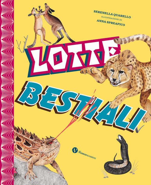
LOTTE BESTIALI ILLUSTRAZIONI DI ANNA SPREAFICO TESTO DI SERENELLA QUARELLO REVISIONE SCIENTIFICA DI MARCO COLOMBO GRAFICA E IMPAGINAZIONE DI ANDREA AMATO, PER TIPIBLU Sopravvivere a tutti i costi. Questo è l’imperativo categorico nel mondo animale. Difesa o attacco? L’importante è il risultato: dalle formiche legionarie, che assaltano in eserciti in grado di creare ponti e […]
OUT OF MY WINDOW – Advent calendar
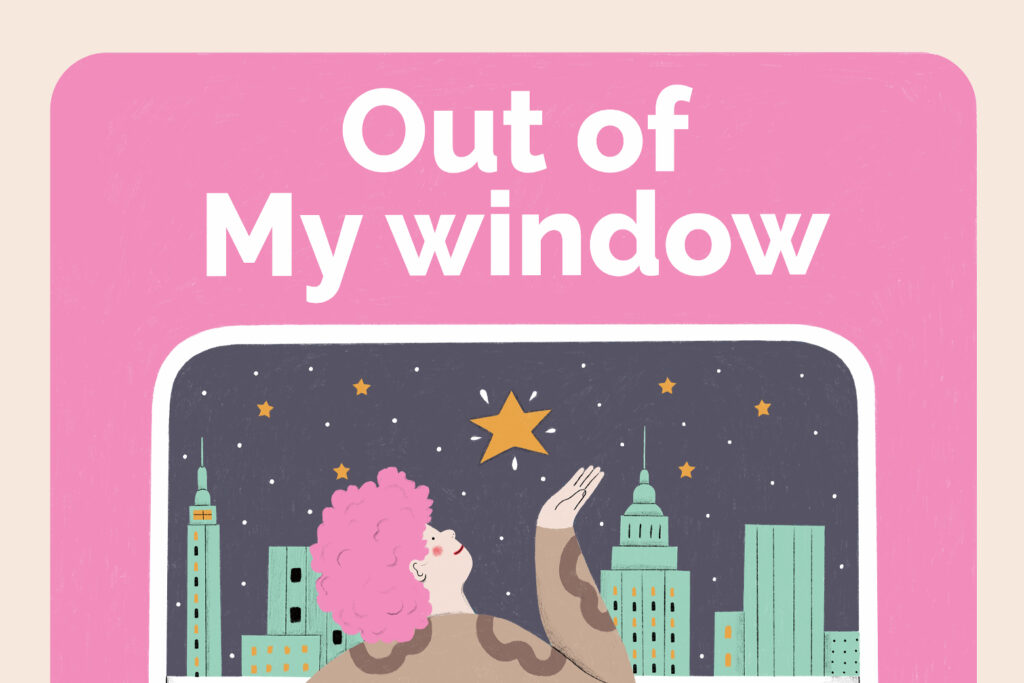
OUT OF MY WINDOW Dalla penna di Marketing Bakery e reso reale da Controversa vi presento questo calendario dell’avvento totalmente illustrato con tema “Natale a New York”. Out of My window, un calendario dell’avvento ma anche un libro che racconta per immagini e parole il Natale a New York. Il Natale a New York ha […]
ARTIGIANO IN FIERA 2023 Exhibition
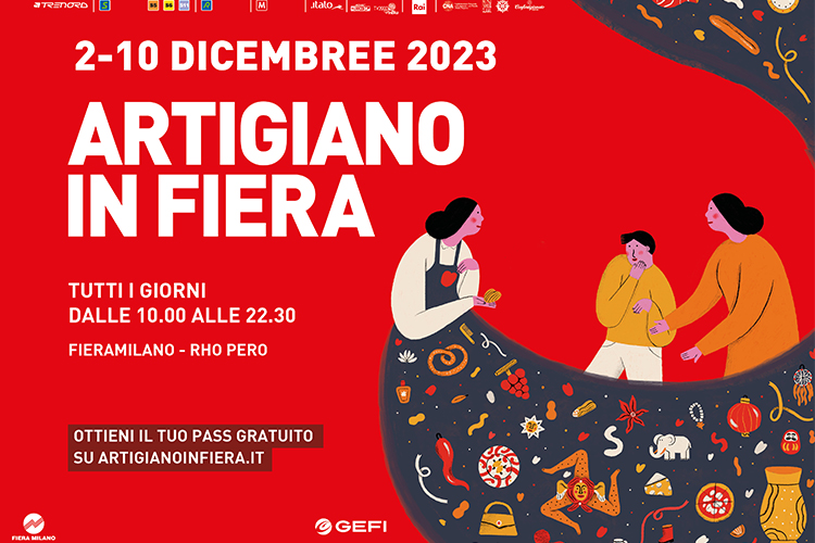
ARTIGIANO IN FIERA 2023 EXHIBITION Per l’edizione 2023 di Artigiano in Fiera ho realizzato dei poster alternativi illustrati che verranno esposti all’entrata dei padiglioni. For the 2023 edition of Artigiano in Fiera I created alternative illustrated posters that will be displayed at the entrance to the pavilions. “Donare una parte di sé”, in questo consiste […]
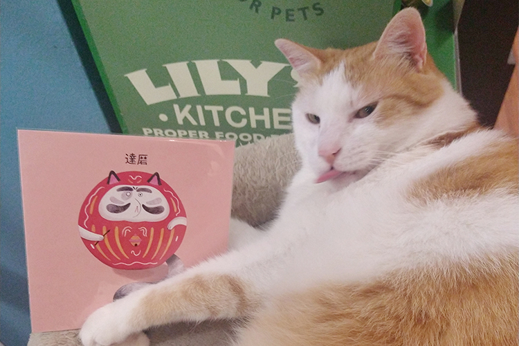
Creating DARUMA LAB Milano
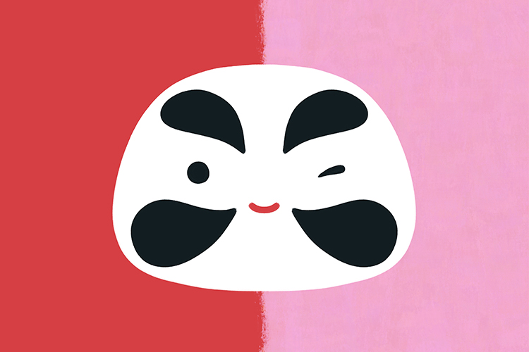
Creating DARUMA LAB Milano Io e il mio compagno Lorenzo Duina abbiamo creato a Milano uno spazio artistico dedicato a Giappone e illustrazione, DARUMA LAB, diventato anche un brand. Il progetto Daruma Lab nasce da una visione comune di Anna Spreafico e Lorenzo Duina, due illustratori di professione e compagni nella vita. Dopo aver ottenuto […]
Crazy Cat Café – Shop
Stampe per Crazy Cat Café shop Ho realizzato delle stampe a tema felino per lo shop di Crazy Cat Café Milano. LUCKY CAT print FANCY TIGER print PARTY CAT print
Collab Acqua di Parma
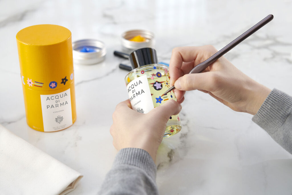
PROGETTO PREMIATO TRA I 50 FINALISTI DELLA CATEGORIA COMMERCIAL GOLDEN PINWHEEL 2023 PROJECT AWARDED AMONG THE 50 FINALISTS OF THE COMMERCIAL GOLDEN PINWHEEL 2023 CATEGORY https://www.youtube.com/watch?v=Sr7xWgaCBas Collab – Acqua di Parma “Si chiama Collab il nuovo progetto di Acqua di Parma in collaborazione con l’Istituto Europeo di Design (Ied): un laboratorio creativo che prenderà vita […]
Aperitivo Festival 2023
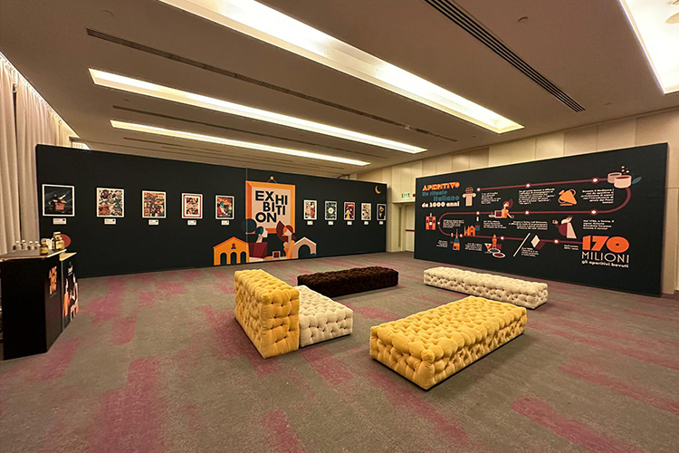
APERITIVO FESTIVAL 2023 Ho avuto il grandissimo piacere di partecipare all’Exhibition di APERITIVO FESTIVAL 2023 in occasione della giornata dell’aperitivo con la mia illustrazione “Aperitivo alla Carta”. Ho realizzato un’illustrazione interpretando il tema dell’aperitivo in modo ironico e frizzante, come sempre mi piace fare, e la donna di cuori ripresa dal gioco delle carte ci […]
Fuorisalone – Cape Best – La città del futuro
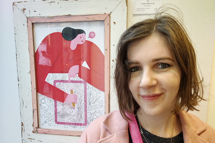
FUORISALONE – Cape Best – La città del Futuro In occasione del Fuorisalone 2023 ho realizzato un’illustrazione per il negozio Cape Best a tema “Città del Futuro” Il concept si basa sulla mia visione della città del futuro, e ho voluto farla progettare da una donna. The concept is based on my vision of the […]
Wanted Cinema – La Folle vita POSTER
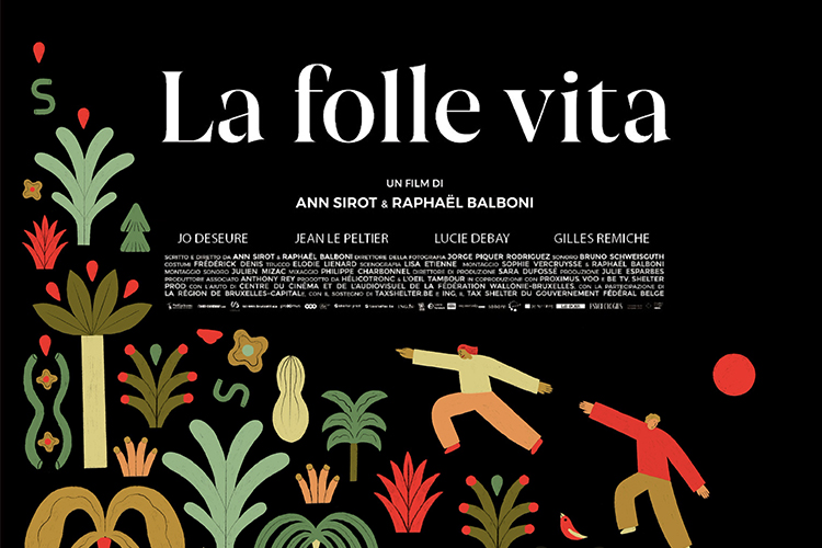
Locandina per “La Folle Vita” di Raphaël Balboni e Ann Sirot Proiezione di Wanted Cinema alla Cineteca Arlecchino Di Milano Ho realizzato una locandina alternativa illustrata in occasione della la prima del film “La folle vita” di Raphaël Balboni e Ann Sirot, alla Cineteca Arlecchino a Milano. “La folle vita” è un film coraggioso, emozionante, […]
La Feltrinelli – Maremosso Magazine
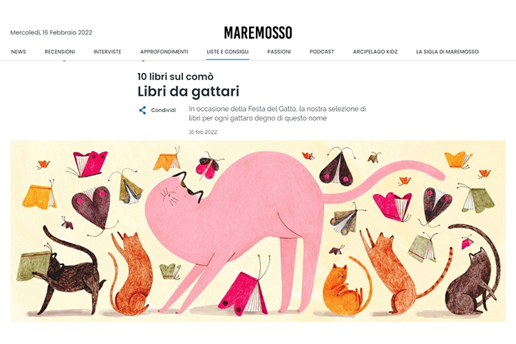
La Feltrinelli, Maremosso Banner per alcuni articoli del magazine online de La Feltrinelli, Maremosso. Ho realizzato dei banner illustrati per gli articoli “L’Italia in Mostra”, “Pasqua a tavola tra uova e tradizione” e “Libri da gattari” della rubricala “Dieci libri sul comò” di Maremosso, il magazine online di La Feltrinelli. LINK AGLI ARTICOLI I created […]